Lettering Design for the Los Angeles Times Cover
Lettering and Typography | Editorial Illustration
LA Times reached out looking for a unique typography and lettering design for their Saturday edition cover page.
the Challenge
Even though the customer had already marked presence in the domain of magazine publishing, the team did not have special skills to create a custom typography or lettering design. They needed a unique design that would pop when added to their magazine layout design on a very tight deadline.
the Solution
First of all, we held a few conversations with the client to understand the exact and actual needs and requirements. A brief was provided that explained more in depth what they expected along with a reference they found on Instagram from one of the lettering pieces that stood out to them.
Though the initial required was only a front-page cover, I also created the drop cap G for the inside page design of the article.
The entire design was delivered to the client in an editable format and the artwork gave magazine the needed facelift to make it ready to be published. The project was completed on time and got published with no delays.
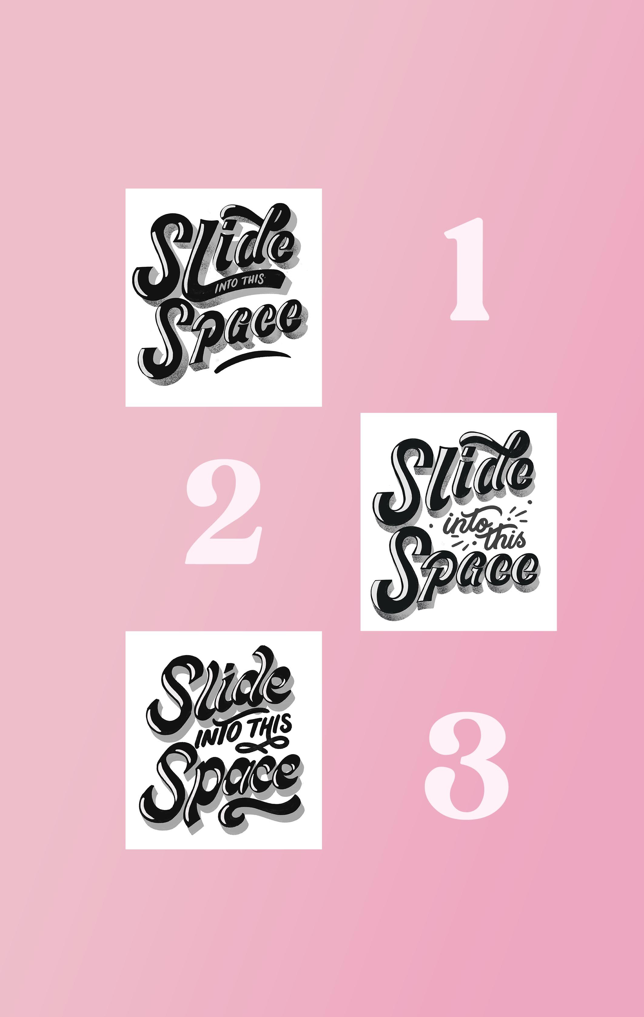
Concept Sketches Options Provided to the LA Times Creative Team for Approval. The Sketch #1 Was Chosen
final Results
The work was completed with perfection and within the stipulated time frame; the magazine found a place on the stand within days. The customer appreciated the final work and how quick the work was done, and he communicated his satisfaction by hiring me again for another custom lettering for a new cover design. What they liked the most was the my easy 4-step design process, how quickly I got the work done and the final illustration that met exactly what they were looking for.
Final Published Cover - LA Times - Saturday Edition
Looking for unique custom editorial lettering or illustration? Let’s talk!
Want to take a peek at my working process?
Check out the video below!


